What's the Big Deal?
[3 minute read] Here's a tangible example of the inflationary dangers of the Wage-Price Spiral. This is what's keeping the Federal Reserve on edge despite free-falling inflation.
This is a chart of year-over-year CPI, aka inflation. In the past few months, it’s been crashing down. This is great, a cause for celebration… right? Not according to the Federal Reserve. Over the past few weeks, Fed officials continue to signal that the coast isn’t clear and significant more work needs to be done to kill inflation.
Hold on. If inflation already appears to be careening downwards, why is the Fed still on edge? Even the most dovish Fed officials continue to be incredibly hawkish. Inflation is free falling but no one in the Fed is celebrating, what’s the big deal?
What’s the Big Deal?
In the FinanceTLDR newsletter, we’ve discussed the Wage-Price Spiral (WPS) at length so I won’t spend too much time explaining it. Nevertheless, here’s a very quick primer.
The WPS is an economic phenomenon where rising wages drive prices upwards, and rising prices in turn drive wages upwards. This creates a spiral of rising wages and rising prices.
As you can see, an uncontrolled WPS can easily lead to runaway inflation.
Although knowing what the WPS is helpful in understanding where inflation could come from, it’s still a very theoretical and high-level concept that people often can’t relate to.
How dangerous or scary can something be if it doesn’t feel real? As such, I decided to seek out tangible evidence of the WPS to better understand the Fed’s stubborn urgency to kill inflation. I didn’t have to look far.
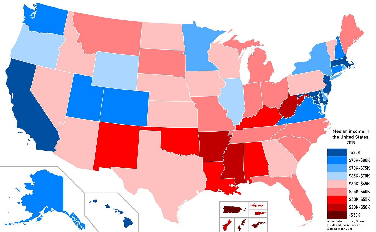
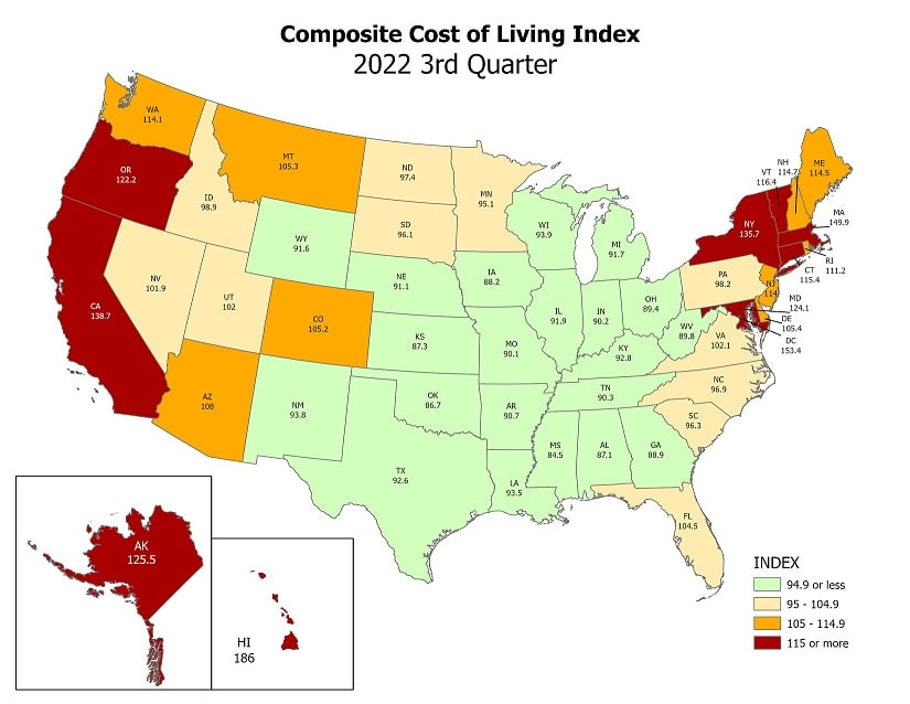
Here are two different visualizations of the United States:
The top visualization shows the median income in each state while the bottom shows the cost of living. It’s clear from these two visualizations that states with higher incomes generally have higher costs of living. Is this caused by the WPS? Readers can form their own judgements but I think this correlation is very likely explained by the WPS.
Anecdotally, I recently visited Poland and pleasantly found the prices of everything to be significantly less than the Bay Area in which I reside, yet the quality of goods and services is basically the same.
What causes this discrepancy? The answer is wages.
If you ask anyone living and working in Poland, they’ll tell you that Poland is actually quite expensive, but to a Bay Area resident with a Bay Area salary, Poland is unbelievably affordable.
Services Inflation
Here’s another perspective on the WPS. As shown above, CPI has been falling but this is largely driven by goods inflation falling while services inflation remains high and might even still be rising. Services are powered by wages and as demand for services go up, the demand of service workers go up and if there aren’t enough workers to meet the demand, their wages must go up as well.
In fact, according to Goldman Sachs, there are currently over 4 million more jobs than available workers!
The US is experiencing a significant labor shortage and this is especially true in the services sector. In other words, the appetite of Americans to consume right now is significantly higher than what the labor market can absorb.
Ergo, Wage-Price Spiral.
This was a short post to share a tangible example of the inflationary dangers of the WPS. In the next couple newsletter issues, I will share a deep dive of Palantir as well as a summary of the 2023 economic forecasts of a medley of top financial institutions including Goldman Sachs, J.P. Morgan, and BlackRock. Stay tuned!


Thanks for the concise article on WPS, learned a lot!
I'm curious to see any data on the labor shortage by sector + sector employment geographical centers (e.g. Bay Area known for Tech, etc.) Tech has been ravaged with layoffs (usually growth sectors go first whenever there's economic uncertainty/downturn) and will be interesting to see if this will continue to reverberate through the real economy or net shortage continues. Either way, looks like big adjustments are in order.